If you want to communicate with your leads and tailor your products and services to their needs, you need to get their details. One great way to get the information you need is creating a high converting registration website form. So how do you make sure that your target customers give out their details through your form? Here’s a checklist you can use to make it happen:
1. Do I clearly communicate the benefits that people get for signing up?
Before people fill out web forms, they typically ask themselves, “What’s in it for me?” If you could answer the question by clearly communicating the benefits of signing up, you’re well on your way to having a high converting registration website form.
Aside from letting people know what they get when they complete the form, be sure to use a call to action that implies that they will get the benefit soon after they sign up. For instance, if you’re offering access to a valuable PDF, your call to action could be “Get Access!” or “Download Now!” Be sure that there are no competing calls-to-action anywhere else on the web page.
2. Is the form accessible to everybody?
Your form should be accessible across all browsers and devices (PC, laptops, tablets, mobile phones, etc.). Navigating even with the tab key should be easy. It should not require JavaScript to be enabled in the browser. The font should be large enough so that nobody has to squint to read anything on the page. It should be user-friendly even to people with disabilities such as color-blindness. Make sure that it does not flash anything more than twice in a second as this could cause seizures.
3. Is the form simple and easy to use?
If you want to make your form easy to use, the best way to start is to evaluate the questions. Which of them are necessary and which ones can you do away with? Remember, the fewer questions you have on your form; the higher will be your conversion rates. You may also use smart defaults that auto populate fields. For instance, a “smart” form can use the person’s city and state to fill out the zip code and area code fields automatically. It can also eliminate unnecessary questions based on the user’s previous responses.
4. Is my form engaging?
Forms are boring, but people get excited over quizzes. They like quizzes that reveal something about themselves and how they’re doing with their businesses, careers, relationships, and another aspect of their lives. You can make a form engaging by turning it into a quiz that piques their curiosity. You reward them with an “aha” moment in exchange for their details.
5. Do people feel safe while they’re signing up?
People are wary of scams, so you must make them feel comfortable about signing your forms. Testimonials and social proof can take away much of the doubt they may initially have, so make sure that these are visible on the page. Also, people are more likely to trust you when they can easily find your contact information.
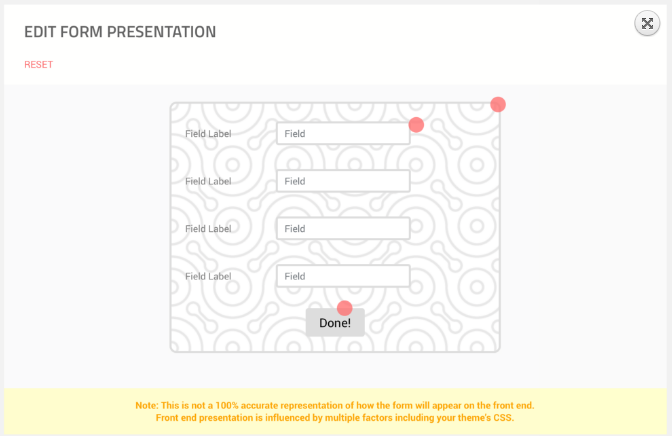
Your form’s design plays a significant role in putting your visitors’ minds at ease. It should look modern and professional. Fortunately, a high converting registration website form is now easy to make. Registration Magic is a WordPress plug-in allows you to create beautiful forms that convert like crazy easily! Check out its powerful features here.
- How to Build a WordPress Event Registration System - December 23, 2016
- Why You Should Allow Users to Register to Your WordPress Site - December 21, 2016
- Want More Leads? Optimize Your Registration Forms! - December 19, 2016
- Creating a High Converting Registration Website Form: A Five-Point Checklist - December 13, 2016