You probably have a website that’s practically a lead magnet and your content resonates with your target audience. However, unless you know how to optimize registration forms for conversion, you won’t be able to maximize the benefits that your website has to offer. You need to communicate with your leads, and to do that, you must collect their contact details.
So how do you optimize your registration forms? Here are some tips that can help you increase conversions:
1. Keep it short and simple.
According to the latest research, 86% of website visitors leave if the sign-up request is too long and complicated. About 42% of them don’t like registration forms because they are too long or they ask too many questions. Remember, fewer problems could mean more conversions.
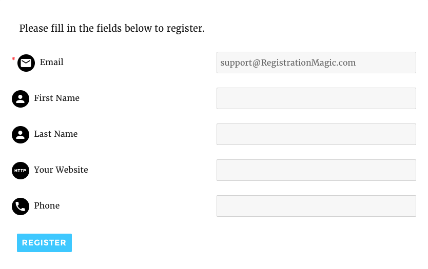
So how many fields should there be? To optimize your registration form, keep the number down to two or three.
2. Put your opt-in form on the right side column of the page.
A study reveals that you’ll increase your chances of having people sign up for 24.6% compared to having your opt-in form on the left side.
3. Allow visitors to register using their social media logins.
Researchers found that 77% of users prefer to register with their social media accounts. Fifty percent of users don’t like having to create a new password and 60% of them already have five or more passwords to remember. Encourage them to register by making their lives easier.
4. Whenever appropriate, autofill the fields.
Doing so ensures that people provide all the information you need from them. Some people provide bogus information because they don’t know what to put in the fields. Autofilling keeps this from happening.
5. After your visitors sign up, bring them back to where they were.
Perhaps they were reading an interesting bit on your website when they noticed your opt-in or registration form. They may not give the form a second look unless they are sure that they can go back to the page without any hassle. Redirect them to that page so they can continue what they were doing before they filled out the form.
6. Ask visitors to enter their password only once.
Some registration forms require users to retype passwords. This is supposed to ensure that users enter their passwords correctly. However, users can get annoyed when the passwords they enter don’t match. A better option would be to allow them to unmask their passwords to check whether they entered their codes correctly.
7. Avoid using CAPTCHA.
You might think you need CAPTCHA to prevent spam entries. However, a study reveals that CAPTCHAs can kill conversions. They can be annoying, especially when they’re too hard to understand. Fortunately, there is a better way to keep spam bots at bay. You can include a honeypot form field—an empty field that you can hide from humans by using CSS. However, spam bots will always find that field and fill it out. They just can’t help it! When the field is not left blank, you know that you have a spam entry which you can either ignore or delete.
The bottom line is, to optimize your registration forms, make sure that they require the least amount of time and effort to complete. See to it that they are well-placed and highly visible on the page.
Your forms also have to look professional. The good news is, you don’t have to worry about aesthetics when you create them. Registration Magic is a powerful WordPress plug-in that lets you create beautiful forms that convert well. Click here to find out more.
- How to Build a WordPress Event Registration System - December 23, 2016
- Why You Should Allow Users to Register to Your WordPress Site - December 21, 2016
- Want More Leads? Optimize Your Registration Forms! - December 19, 2016
- Creating a High Converting Registration Website Form: A Five-Point Checklist - December 13, 2016